Just recently I presented a short talk on time-travelling debuggers at Code BEAM Stockholm, so I thought it would be interesting to go into some of the things happening behind the scenes here.
Last time I wrote about my general approach to writing talks, so this time I’ll just discuss the general design ideas that went on this one in particular.
It was a bit of a wild ride, to be honest, and I panicked more than usual; but such is life. It was still a fun experience in the end :’)
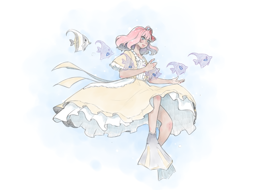
The topic
Back when the CFP was going around, I struggled a bit with deciding what to talk about. I thought about just rehashing my previous talk on security types for information flow control and making it fit on the BEAM, and considered some other projects I had been working on, but ultimately ended up sending a proposal to talk about time-travelling debuggers.
At that point I had no idea what exactly I was going to talk about, but time-travelling debuggers can be quite fun, even if not exactly popular, and they fit the BEAM model a lot better than stepping debuggers could. They’re, indeed, a natural fit on top of BEAM’s tracing capabilities. And I had been working quite a lot with them recently, particularly with Crochet being designed to enable time-travel as a regular debugging tool.
The theme
For my talks I like to come up with analogies that can express whatever I’m discussing using other real-world concepts that are not necessarily related to computers, but rather things more people are familiar with. I feel like this helps convey the general idea behind what I’m discussing even if people in the audience are not experts in the area (and even if they never get to implement or work with what I’m discussing).
Last time I’ve used a small business ran by a witch employing tiny cats as a vehicle to discuss information flow control policies as types and dynamic tags; this time I actually considered using a more hard sci-fi concept, and thanks to me being obsessed with 白い砂のアクアトープ (The Aquatope on White Sand), an animation about a few kids working at an aquarium, I thought it would be interesting to have something with marine biology’s aesthetics.
Of course, I soon learned that I knew nothing about marine biology and I couldn’t really draw any detailed underwater scenes. So I had to drop the “hard” part from the sci-fi and stick to the fantasy/surrealist themes I’m used to instead. Even then, a lot of my time working on this actually went to researching about marine biology—following vlogs and blogs from marine biologists, learning about the different kinds of work they do, learning about different kinds of creatures they study, and so on.
My youtube history is now overran with marine biology-related videos (not complaining) :’)
The story
Though I decided on the theme quite quickly this time, I struggled a bit with the story. I’ve been quite into interactive adventure books recently (and interactive fiction in general), so I wanted to write something that felt like that.
But it’s really hard to make true interactive experiences work in a talk, and I wanted to be able to cover a lot of material as well, so there that tension was a bit difficult to overcome. Eventually I just settled with some light role-playing to discuss the idea of debugging, and left the remaining technical parts as a separate section. Not entirely happy with it, but I suppose that was the best compromise I was able to come up with in the time I had. I’d like to experiment with different approaches next time, though.
For the story structure I used the Hero’s Journey trope again. It feels a bit lazy to structure the story portion that way, but it works, and it lifts a lot of weight without being too distracting, since people are already familiar with the “here comes the hero, oh, but the hero has a problem, but they now find this magical thing that solves the problem, oh no, another problem…” kind of story structure anyway. In a 45 minutes talk where the story isn’t the point, I think it works as a reasonable compromise.
But I do want to experiment with different structures, too. Maybe I’ll get the chance next time!
So, with this structure, I mostly wanted the audience to feel like they were debugging a system they were not familiar with together with me. Of course, that only goes so far, as I’m the one driving it and the amount of time doesn’t leave much room for interesting nuances and emotional beats. But I wanted it to at least show, in a reasonable way, why one would make the choices that the “Hero” in this story makes. If you already have observability tools, why would you go for anything else, really? I wanted the story to answer those kind of questions, so the technical part could just focus on the technology part rather than having to motivate everything again.
I also wanted to try a bit of environmental story-telling this time to tell the audience more about the characters without being necessarily distracting and overpowering (of course, this only works for a sighted audience, but my talks are, unfortuanately, still very much designed with a sighted audience in mind). But due to time constraints this didn’t pan out very well. You can see some bits and pieces of this in some slides, but there isn’t a natural conclusion, or much about the cast that you can learn in the final images.
The cast
This time I wanted to have characters with a bit more of personality and add some life to them. In my last talk I had a cast that was mostly entirely defined by their aesthetics, so none of them were really memorable or felt like they were alive. The only ones who got some kind of name were the protagonist (The Witch), and the cats she befriends (The Ghost Cats, and The Magician Cat), but even there they were kind of lacking in personality.
I did start designing from aesthetics again, though. But this is generally how I approach character design anyway. I just try to find something that looks good, on a very vague idea of a character, and then I flesh them out a little bit later (or “a lot” if I’m writing a longer form of fiction).
For this I mostly had “roles” that I wanted the characters to play, first. So I had The Hero, who would be the marine biologist played by the audience in order to save the ocean; The Scribble, who would log all of the things happening in the ocean; The Librarian, who would figure out how to correlate and summarise logs; and The Witch, who would use weird devices to observe things in the ocean. The Princess came a lot later, mostly because I realised that The Hero didn’t have enough of a reason to go through the journey otherwise, and she ended up being like that one person who just shows up randomly at the tavern to recruit adventurers in trope-y D&D adventures.
(Yes, I’ve ran those games before as a DM. The person-showing-up-randomly-at-the-tavern-to-recruit-you is a classic and I don’t care if you find it cliché. I will still use it in my games)
I also had been watching a lot of videos about deep sea creatures at the time, so I thought it would be fun if the characters The Hero encounters in the journey were somewhat inspired by marine creatures (it ended up not being all deep sea in the end).
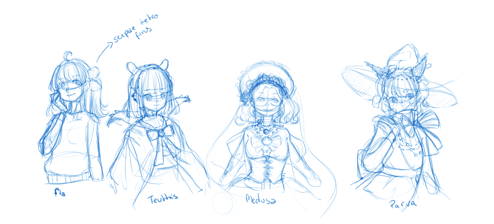 The initial design of the cast really changed quite a lot!
The Hero (Fia)
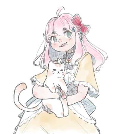
Fia was the first character I designed because I mostly just started with drawing something that would work as a title for the presentation. The choice of the name was quite arbitrary, however. I just liked the sound.
My idea of Fia was that she would be a marine biologist working with tropical coral reefs for her PhD. I had a lot of trouble trying to figure out what exactly her research would be about, though. Some of the ideas were things like studying changes on the population of sea urchins, or the effect of climate change on coral reefs, but I didn’t have any marine biologist I could bounce these ideas from so I ended up just sticking with the vague and unsatisfying “she studies the ocean”.
At first, she didn’t really have anything that stood out as marine-biology-related, but I had this idea that her partner would be a hairstylist who’d be very into playing with her hair and giving her cute hairstyles, so I thought about giving her a hairbow in some way. Later on I revisited that and made it somewhat inspired by the Serpae Tetra’s fin.
There wasn’t too much thought given to her colour palette, I just went with what felt right at the time. Mostly I was trying to keep the contrast reasonable.
Fia has two cats: a calico cat with orange coating named Count Flamino, and a white persian cat named Lady Micarlla. But since her PhD work forces her to travel for months, she’s often just seeing her in photos and videos that her partner sends/streams.
The Scribble (Teuthis)
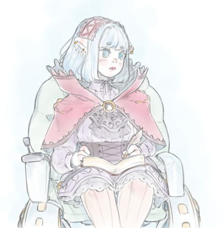
I was a bit obsessed with everything about the Vampire Squid From Hell the first time I saw it and I just had to make a character based on it. You might imagine the scribble role fits because squids have an ink sac, but the vampire squid doesn’t have an ink sac (nor is it really a squid (or an octopus, for that matter)).
So, instead of an ink sac, the vampire squid has this long velvet-like cape around its arms, and when distressed it just hids itself behind its cape. Too Cute/10. I thought a vampire squid character would be very shy because of this, so I tried designing a character in that direction, and I ended up with a gothic girl who doesn’t talk much.
When it comes to the design I’ve tried incorporating the cape along with the cirri. That’s why the cape has these thin filaments sticking to the top of it, and the hem likewise has this triangular pattern along the seams. Originally she had a very long cape, but when I decided to give her a wheelchair things got a lot less practical there so I decided to shorten it up a little bit. But I think it made the design breath a little more as well, since the long cape kept getting in the way of the rest of her outfit.
Because the vampire squid mostly swims with its small flaps, which you can see in their head, I thought it would be nice to make her ears work that way as well. I don’t think she would swim by flapping them, however, but it looks cute so who cares :’)
Initially she didn’t have a wheelchair, as I said before. But I thought it would be nice to give her one given the vampire squid’s behaviour. Due to being a deep sea creature who doesn’t actually get to eat much, the vampire squid mostly tries to conserve energy. But when it really needs to cover long distances, it has a mechanism to do so. That sorta reminded me of people with POTS and other heart issues (like me, ahaha) who might end up using a wheelchair as a mobility aid when they really need to cover longer distances. So I gave her one, and changed the design around a bit to make it work (originally her skirt as a lot poofier).
On the wheelchair design specifically, it feels weird that you’d have one in the sea, right? Since the ones we have are designed to work on the land. But I thought more in terms of how people use ROVs to observe deep sea creatures these days, and collect materials from the sea floor, so they need to be very versatile in how they move through the water and through the sea floor. The design takes quite a bit of inspiration from them, and the wheels can actually be rotated to change the direction of the jet propulsion, as well as act like all-terrain wheels when moving through the sea floor.
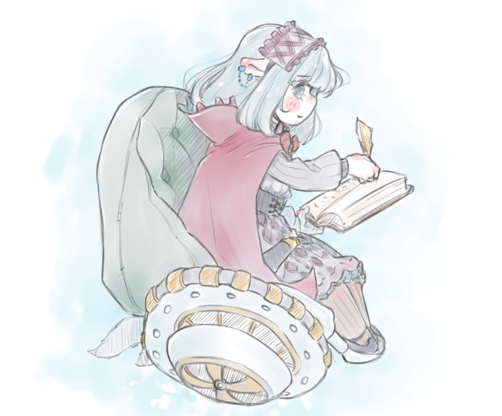 Earlier design of the vampire squid
This also works very well with the power wheelchair-inspired design, because people with dysautonomia are much less likely to be able to self-propel regular wheelchairs. At least for extended periods of time. Imagine that, for example, in my case, self-propelling a wheelchair would make my heartrate jump all the way to 180bpm. I’d just end up passing out randomly on the street :’)
Oh! Her name ended up being Teuthis as a short for the scientific name Vampyroteuthis Infernalis (literally “Vampire Squid From Hell”).
The Librarian (Medusa)
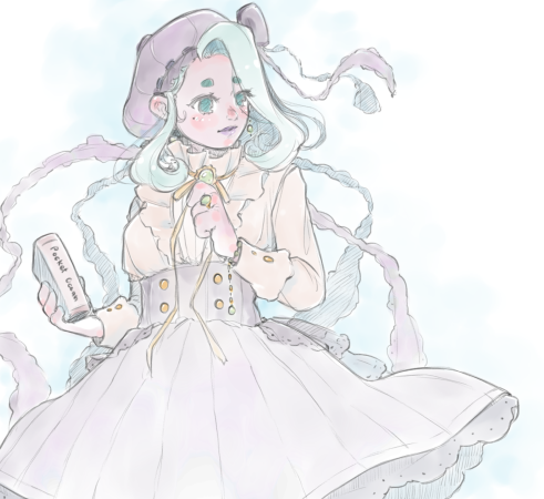
Honestly, when I first saw the Giant Phantom Jellyfish, I was immediately bewitched. It’s just such a majestic creature. And its shape kind of reminded me of very delicate wedding dresses with big veils and lots of lace and frills. But then I’m biased towards that kind of fashion to begin with.
That they can reach up to 10 metres! is no short of amazing.
So, for the design, I initially thought about capturing its arms through very flowy and wavy hair locks, but in the end I gave her shorter hair instead, and a beret in a shade closer to what ROVs can capture these days from the depths of the sea. Then I’ve added frilly ribbons to it to refer to the arms. The little bow at the top of the beret was actually inspired by the design of some Alice and the Pirates accessories I own.
When it came to clothes, I originally had her in a more lacey Lolita, but ended up with something that mixes Dark Academia and XVIII century-inspired vintage clothing, and I think it worked a lot better with the contrast and how the silhouette reads. It also fits the role of librarian a lot better. The green in her colour palette doesn’t have any specific reason, I just thought it’d look cute as an accent colour :)
At first I didn’t really have much of an idea of what kind of personality she would have, and I was leaning towards the Big Sister trope. But then Kanon Shizaki started publishing covers on her instagram, and I was like “okay nevermind she has to be the Ikemen trope.” Of course, I’m not talented at voice acting or singing like Non-chan is, so I tried keeping it more subtle, I didn’t want it to get too grating when I inevitably get it wrong on stage :’)
The name Medusa comes from the scientific name Stygiomedusa gigantea (“Giant Infernal Jellyfish (?)”).
Also, did you know that scientific classifications are its own kind of hell?
The Witch (Parva)
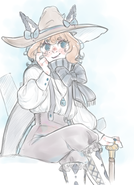
Nudibranchs are amazing, and Sea Bunnies definitely have stolen my heart over and over again. They’re just such adorable little creatures, I could look at photos of them for hours.
These super tiny, adorable creatures live on the sea floor and feed off sponges. When it came to the design there were three things I wanted to capture primarily. The sea bunny’s body is covered in black papillae, which likely has sensory roles, but reminds me of freckles, so I gave the character facial freckles. Then you have the gills, which kinda look like a bunny’s tail, and I thought I’d use a tailcoat for that… but I ended up only keeping the tail part, and hooking it to a muffler instead. And I just kept the ears as-is, like with the vampire squid.
The remaining of the design was more inspired by the witch role. At one point I thought about making Parva a man (because I realised I didn’t have any in this talk… again…), but ultimately I just went with the original idea. I did make Parva dress more androgynous, though. It’s not genderless kei, but rather ouji-inspired fashion with a few more classically feminine touches here an there. Now, you might think that this was driven by the sea bunnies having both female and male reproductive organs, but I only learned that afterwards. I actually like ouji a lot, but I design surprisingly few characters wearing it.
When I worked on Parva’s design, I had this image of a sassy gamer in mind. But she’s also awkward. The name Parva comes from the scientific name Jorunna Parva.
The Princess (Mobula)
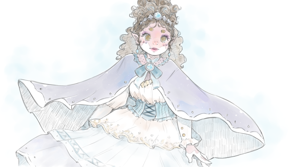
The princess was a very late addition to the cast, and kind of a functional one. Her being based on the Giant Oceanic Manta Ray was also a function of her role. Mantas are very intelligent animals who can sense subtle changes in their environment’s health. Which fit quite neatly with my litle premise.
When it comes to the design of the character, I originally had in mind making her a Black woman with more coily hair, but I underestimated my lack of knowledge there and, due to lack of time, had to move to what I was more familiar with. So I made her a woman from a tropical country with darker skin and wavy hair instead. Because one of the distinctive feature of the Mantas is the unique discolouration patterns that each individual exhibits, I decided to give her vitiligo as well.
Originally, the only fashion choice I had conciously made was giving her an intricate hairstyle, upon which rested a crown, and the long velvet mantle that she wears. The mantle’s design evolved a bit and I added some sheer fabric to it, and made the brooch that holds it together have a small polished stone as well. The small diamond patterns along the mantle’s hem are meant to capture the gills through which the Manta breathes.
The rest of her clothes didn’t get as much love, though. I just went for things I had or would have on my wardrobe, but when I was done with the first iteration she looked a lot like a medieval peasant so I added a few more details and embroideries to the fabric. I’ve also changed the sleeves a little bit, as the original one used ribbons for fitting it to the wearer’s arm, and I didn’t like how it read.
The pointy ears were slightly inspired by the Manta’s “wings,” in fact. Even though the mantle she wears already captures that part. I do think the pointy ears look cute on her though, and since I was also having Teuthis’ ears be slightly different I decided to just go for it.
Though it doesn’t read very well due to my lack of artistic talent (and time), she has small stones adorning under her eyes. The only reason for this is that I love the look in some Japanese street fashion substyles and hadn’t really designed many characters using them, so I thought “why not?”
When I thought about her personality, I wanted her to feel very polite and elegant, but I also wanted to give her some quirky aspect that made her feel a bit “closer” to the hero, rather than some distant noble. I also didn’t want the talk to be too difficult to follow, so I didn’t change her vocabulary too much—I keep finding how different it is to write for a textual medium, like in written fiction, compared to writing for an oral medium, like in a talk. I ended up changing her speech pattern and speed, instead. But now she does talk a bit too fast :’)
The name Mobula comes from the scientific name Mobula Birostris.

